Color Palette
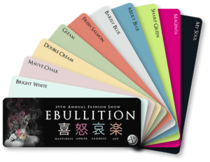
When considering the color theme for this year’s fashion show the class committee was in search of a pallet that spoke to the four emotions of the show Ki, Do, Ai, and Raku. These Japanese characters, which translate to happiness, sadness, anger, and joy, are the backbone of this year’s show aimed at giving viewers a burst of emotions. The color palette chosen here expresses each emotion as well as provides neutral tones for seamless transitions and the overall harmony within the show. The inclusion of moody cools and energetic warms in this color palette allows viewers to be entranced with each emotion and get a full sense of the theme.
-Olivia Kohorst
Bright White (Pantone 11-0601)
Bright White is a neutral Pantone color. This hue produces a positive image of happiness and joy featuring white shade with tints of light grey. Fitting mainly into Ki and Raku emotions, Bright White can also be shown in the Do and Ai scene to provide balance between colors. Bright white is useful and essential for a clean backdrop for feature photography and helps show off what is worn by models. Bright white also brings a cheerful yet neutral aspect to the show that is used within marketing, photo opportunities, and many garment accents. -Marissa Conte
Mauve Chalk (Pantone 12-2902)
Mauve Chalk is a very light shade with tints of red and tan. Using the four concepts of Ki, Do, Ai, and Raku from the theme of the show, Mauve Chalk is most suitable for mild emotions. Taking this into consideration, this hue mostly represents the emotions of sadness and happiness and steers away from the stronger emotion of anger and joy. Mauve Chalk brings a mundane calm with a hint of passion to the show. -GQ
Double Cream (Pantone 12-0715)
Double Cream is a neutral pantone color that harmonizes with every other color featured in the show. When considering each scene, Ki Do Ai Raku, double cream is the perfect neutral color allowing each emotion to connect to the other. What this hue provides to viewers is a grounding and balanced feeling when diving deep into each emotion. This hue is also a main color within the fashion show poster feature through the Japanese syllable Ki.
– Manami Horikawa
Gleam (Pantone 12-0317)
Pantone color Gleam is a soft cool tone. The relaxed green hue gives viewers a sense of ease and tranquility. Such a muted tone works well with emotions on the lower end of the spectrum. When thinking of each scene individually Gleam fits seamlessly into the happiness emotion Ki. This hue also provides balance and harmony within the show as a whole. – Johnathan Jablonski
Fresh Salmon (Pantone 16-1542)
Pantone color Fresh Salmon is considered a soft warm tone. This hue presents a positive image that fits into the emotions happiness and joy. Fresh Salmon is one of the main colors of the show and is featured on the raku syllable within the marketing poster. This hue is not only a feature color, but greatly harmonizes with the many of the other show colors. Positive feelings can be related to this lovely color. – Chie Kai
Barely Blue (Pantone 12-4306)
Pantone color Barely Blue is an essential cool that reads and feels like a neutral for this year’s fashion show color palette. Provoking an airy movement and a steely calm this hue fits into each emotion, happiness, anger, sadness, and joy seamlessly. Barely Blue allows for some of the louder hues to stand out while at the same time being the perfect base to tie them all together. Having a color like this provides a clear path for the theme to shine and can be seen throughout many aspects of this year’s marketing. – Olivia Kohorst
My Soul (Pantone 19-4010)
Pantone color My Soul is deep and dark. Bordering on pure black, this hue brings on deep emotion as well as substitutes as a strong neutral background for marketing purposes. My Soul is an excellent color to feature within the emotions of anger and sadness considering its strong saturation and dead of night presence. One can easily be pulled deeply into this hue when implemented correctly, bringing an entrancement to the show as a whole. – Olivia Kohorst
Milky Blue (Pantone 15-4415)
This shade of blue has cool grey undertones, giving it depth and body. The feeling you get of this shade is not simply a pretty sky, but more complex and layered. This hue could be used in any Ki Do Ai Raku scenes, as it can be viewed as something joyous and spring, or melancholy and sad. Choosing a blue like this for our show allows us freedom to interpret colors differently, based on our scene emotion and our inner thoughts. – Jessica Piper
Sharp Green (Pantone 13-0535)
Pantone color Sharp Green is a gentle pastel color reminiscent of a milk matcha or sprout. This shade is easily harmonizes with any color and could be featured in any 喜怒哀楽 (Ki Do Ai Raku) scene. Sharp Green fits especially well into the Ki and Raku scenes as it releases a strong euphoric feeling. Taking personal viewing into consideration, this color could also express the many different skin tones. – Yuuka Sano
Magenta (Pantone 17-2036)
Pantone color Magenta is a warm tone made up of violet and red and is absent of any greens. The color invokes the feelings of joy and happiness through its cheerfulness and content demeanor while remaining both relaxing and energetic. The main feeling provoked by this hue is one of happiness, however its relaxing nature can cause depression and despair in those suffering from chronic mental illness. The excess energy can also promote a feeling of being overwhelmed, irritated and anxious. Therefore, Magenta can be expressed within each scene. – Kim Truesdell